Responsive design has come a long way since it started being
implemented as a popular form of web design to merge desktop and mobile
versions of a website into one, easily maintained design. And thanks to Google’s
mobile-friendly updates over the past year, it became more important than
ever to figure it out.
But while responsive design is the one of the best ways to create
a cohesive design across a myriad of devices, it also requires skillful
optimization in order to be effective. Care must be taken to design a site that
is friendly to both the desktop AND mobile users.
Here are three ways that Sales & Marketing Technologies
optimizes responsive design in order to get you more conversions:
1. Optimize image
scaling
Most images are programmed to scale down with responsive
design. However, what looks great on a desktop can suddenly become a
distracting part of a mobile site. If an image takes up the entire phone
screen, or only serves as fluff, it may be time to rethink how that image is
used device-to-device.
Here’s an example that shows a good use of image scaling for
the mobile user. The image that is used as a focal point for desktop is scaled
down to make room for the more essential features, such as navigation and call
to action.
Desktop view:
Mobile view:
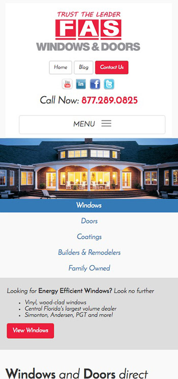
2. Simplify
navigation
Having a visible, easily accessible menu and/or search bar
for mobile visitors may be one of the most important features of a mobile site.
That’s why in the example above, the menu has been condensed. Most mobile
visitors are coming to a mobile site with a single objective in mind; they'll
waste no time in finding the menu bar, searching for a keyword, and clicking to
the page they need.
Here’s the expanded menu. Notice that the Contact Us and
Call Now calls to action still stand out prominently above the menu. This is
because most on-the-go mobile users are in search of a way to contact you.
3. Shorten and
optimize text
If you don’t shorten and optimize text things can go
horribly wrong. The desktop version of
your website or landing page may require developed copy to explain your product
or service. However, on a mobile site, text tends to get crowded and confusing.
Take this example for instance…

Their page looks fine on a desktop. It’s well laid out and
has good copy points. But once that gets sized down for mobile, it’s a
different story.

Now the text completely takes over and is almost impossible
to read. It also pushes down their very important call to action, which will
lose them sales.
Optimize your Website
with Responsive Design
While responsive design creates a seamless experience for
your customers across devices, it is important to understand mobile user
behavior in order to avoid common mistakes and increase conversions.
If you need help designing your next website or are looking
to get more conversions out of your current website or landing pages, call
Sales & Marketing Technologies today at 407-682-2222 or use the contact
form below to talk to one of our talented team members.